
As I play with Luminar, I find some filters very useful not only for what they do primarily, but for how differently they can be applied or adjusted. Today I’m going to talk about the Color Contrast filter.
This is what the developer website has to say about this filter –
“Cycle through the color range, and watch as a color becomes lighter while the opposite becomes darker for a significant contrast. With this filter, give an otherwise flat image a more dynamic and interesting feel.”
By default the hue slider is all the way to the left, by moving it along the rainbow you will be 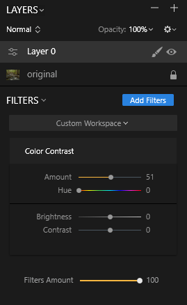 selecting the color that you want to make brighter in your image; the one you want to emphasize. A really neat exercise is to crank the amount slider up so that it’s dramatic, then run through all the hues and see what it does to your photo. It’s quite surprising and achieves many different looks that you might not be able to visualize ahead of time.
Once you have the color you want, now you can adjust how light that color will become with the amount slider. Brightness seems to affect the whole image as does contrast. Again I find it more useful to leave the amount slider fairly high so I can really see what’s going on. Then I dial it back to the level I want.
To complicate things further, change the type of layer you’re working with. I changed from a Normal layer to Hue, Color and Luminosity just to see how the filter reacted and it was interesting. So many options can be dizzying at first, but it’s important to understand how each tool is applied and how many different ways it can affect your pictures. Only then can you fully realize your vision for your image; whether it be a strict documentary approach or a complete change.
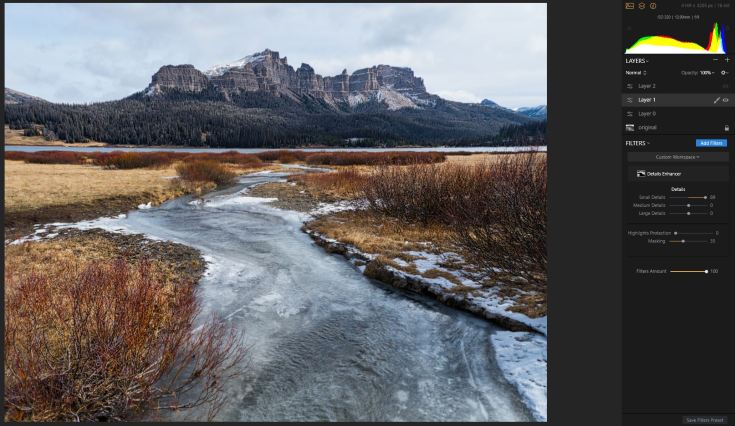
While fooling around with the filter in this scene –

I noticed that the riverbed got brighter when I had the orange end of the spectrum selected. Hm. It wasn’t something I wanted or needed in this shot, but kept it in mind for others. Soon, I found one. This time I used the filter with a gradient mask to confine it to the water in the foreground. I didn’t want the effect up in the trees or rocks and it worked great!

Here it is without the filter applied (and a few others) –

So how else could I use this color contrast? Going through my archives I found this shot from Wyoming that I hadn’t done anything with when I took it. Why oh why? Taking it through some basic adjustments in Luminar gave me this –

To give it punch I boosted the yellows using the color contrast filter and that in turn darkened the blue in the photo which gave me some drama in the sky. I dialed down the brightness and dialed up the contrast to get a more intense, forbidding look; exactly what I felt the day I took it. I was about to hike the highest elevation I’ve ever done (over 9000 feet) and was excited at the prospect and the solitude. I think this image reflects those emotions nicely.
Here it is without it –
Cool huh?
