
This time more photos from Arizona and more Masking techniques in Lightroom. The gift that keeps on giving, especially for those of you who celebrate Christmas – I hope yours was shiny and bright.
I’m kind of on a roll with these. For this session I’m going to concentrate on a couple of things – skies for the most part, but also Mask Properties and Interactions. I’ll be using the Select Sky feature and also show some ways to even out the sky when using a polarizer on a wide angle lens as in this first photo.

In this image I needed to correct an over-polarized sky. In the field it was difficult to really tell how cranked on the polarizer was. When I got the picture into Lightroom I was severely disappointed. Usually my polarizer technique is better than this, but what a more perfect opportunity to see if I could even it out with Masks. Here’s where the difference between Add and Subtract and Intersect With becomes really important and can produce slightly different results. Look at the upper right corner in this comparison –

The tree line in the far distance was my trouble spot. That kind of blue bird sky often looks blue-er in the small branches of distant trees, basically creating an extra-blue halo that looks really awful if you have to increase saturation or exposure in the sky. So could Masking help? I think it does, but in varying degrees depending on how you Mask.
To my eye, the Radial Gradient Intersect with Luminance Range looks the best in the treeline, but my Radial Gradient Mask was too constricted and produced some banding. Easily fixed by either expanding the R.G. or by choosing a Linear Gradient instead.
Using the same corner of that shot, check out the Mask icons below and how each Mask looks –
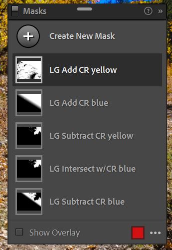
Starting from the top – notice all begin with a Linear Gradient in the upper right –
- Adding a Color Range changes the color throughout the photo, not just in the L.G. and you can still see the L.G. in the icon
- If an Added Color Range only occurs within the confines of a Gradient Mask you will only see the Gradient Mask in white
- Subtracting or Intersecting opposites creates essentially the same mask (3rd & 4th down)
- Subtract from a Gradient shows the Gradient and what has been subtracted from it (in black)
Given that many of the Mask techniques produce similar Masks, it’s the components of the Mask that will make the most difference – Luminance v. Color Range for a blue sky, for example. Subtracting yellow from as sky edit v. Intersecting with blue. Quite subtle, but worth experimenting with so you will know what suits your image best and when.
This next photo has that polarized look that often shows up with wide angle shots. It had some other issues as well.

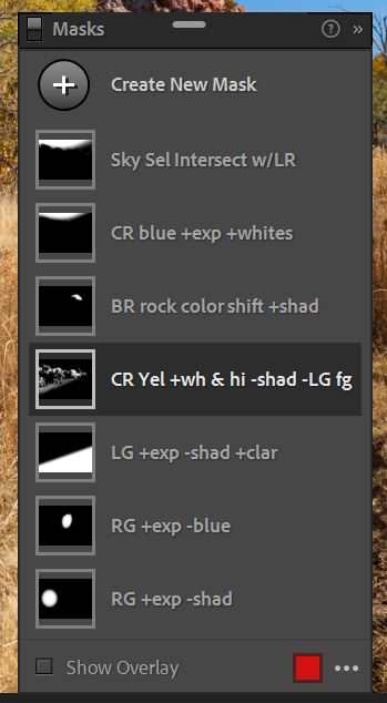
Here is what the Mask Panel looked like after I made all the changes to fix the things I listed –
There are number of different techniques within each mask, taking it from the top –
- Sky Select Intersect with Luminance Range
- Color Range Blue increase exposure & whites
- Brush to change rock color & lift shadows
- Color Range Yellows to raise light areas and lower darker ones & Subtract foreground using a Linear Gradient
- Luminance Gradient to increase exposure, darken shadows and add clarity to fg
- Radial Gradient to raise exposure in tree but Subtract Blue
- Radial Gradient to open exposure in tree, but keep shadows dark
And here is the finished version –

Check out that sky! After looking at a video explaining some methods for fixing a polarized sky like this, I decided that even though I could do it in Photoshop using the complex selection and masking tools explained, it was easier and faster to do it in Lightroom. I used two masks as you can see; first I selected a Color Range in the darkest parts of the sky then increased the exposure and the whites, second I Selected the Sky and then a Luminance Range that overlapped the darkest parts and some of the mid-tones. Careful blending smoothed the shading into a more even look. Finally I did a Global Adjustment in the blue color channel, raising the overall luminance. To me it looks more natural and less exaggerated.
Oh and here’s the shot we started out with –

All this experimentation led me to come up with a list of how Masks seem to behave all the time –
Basic Mask Rules
- Every Mask in a Mask Group acts independently UNLESS it is a Subtract or Intersect sub-mask
- Clicking the Add button creates a new Mask within the Mask Group – it will function on its own
- Subtract from a Radial or Linear Gradient seems to confine that subtraction to the Gradient space
- Add seems to add it everywhere in the image, not just within the Gradient or Mask Shape (evidence that Add creates a new, independent mask)
- Intersect With restricts the new element to the confines of the Mask Shape
- The checked Invert box makes more sense given that behavior
- It is like Venn Diagram capturing the overlap between two (or more) Masks
- Intersect With does not work well to SUBTRACT a particular element from a Mask
Phew! I hope that helped and didn’t confuse matters more. The new aspect of Local Adjustments is interesting, but not necessary to use for every photos. As a matter of fact, using them in their straightforward manner is mostly how I still work in Lightroom.
Onto more Arizona images. These two are from the shores of Lake Pleasant where I did my day of bird photography. While waiting for Ted and his boat, I shot some of the wonderful cactuses in the area.

When I first got that one into Lightroom, I was flummoxed as to whether I could do anything with it. I remembered it being very bright, and hazy with strong silhouettes on the crest of the hill. It was pretty muddy and flat when I saw it. What to do? After some basics with RAW adjustment, I brought it into Photoshop and worked with luminosity masks using the TK8 plug in panels. Now I like it.
Same with the one below. It just sat there in the catalog until I started teasing apart the major aspects of the photo, of any photo really – that is luminosity (brightness or darkness of a pixel) and color. That’s all there really is and sometimes you have to know how to get at the potentialities of a photo and bring them out. These aren’t stupendous photos with amazing light, but they are part of my trip and what I saw and it’s important to me to get them in as good a shape as I can. Working with everyday pictures is as imperative as the epic shots you get on those workshops you pay so much money for. If you can’t do one, how the heck can you do the other? While not ever snap I take makes it to final editing, I do try to see the potential. I try to remember why I bothered in the first place.


I wish the light had been better, but I doubt it ever is that often in the desert.


So I made do with the brightness and the harsh contrast and tried to make them work for me.

So that wraps up this tutorial featuring Arizona images. I have more to share, but may not wrap tutorial info around them. They’re different for sure – ancient Hopi ruins and artwork as well as the stunning cliffs on which they built their homes.

Leave a comment