
All the photos in this post were taken before there was a lot of yellow and orange in the trees. But with a few tweaks in Lightroom, you can make your photos look as though there was. Is it cheating? Maybe, but it comes down to your aesthetic and your goals. Plus, if a painter was next to you working the same scene, would she have made those colors warmer? Created the illusion of autumn? Probably, and now you can, too.
This is Meyers Falls on the Pine River in Florence county. Not super dramatic, but quite remote and beautiful just the same.

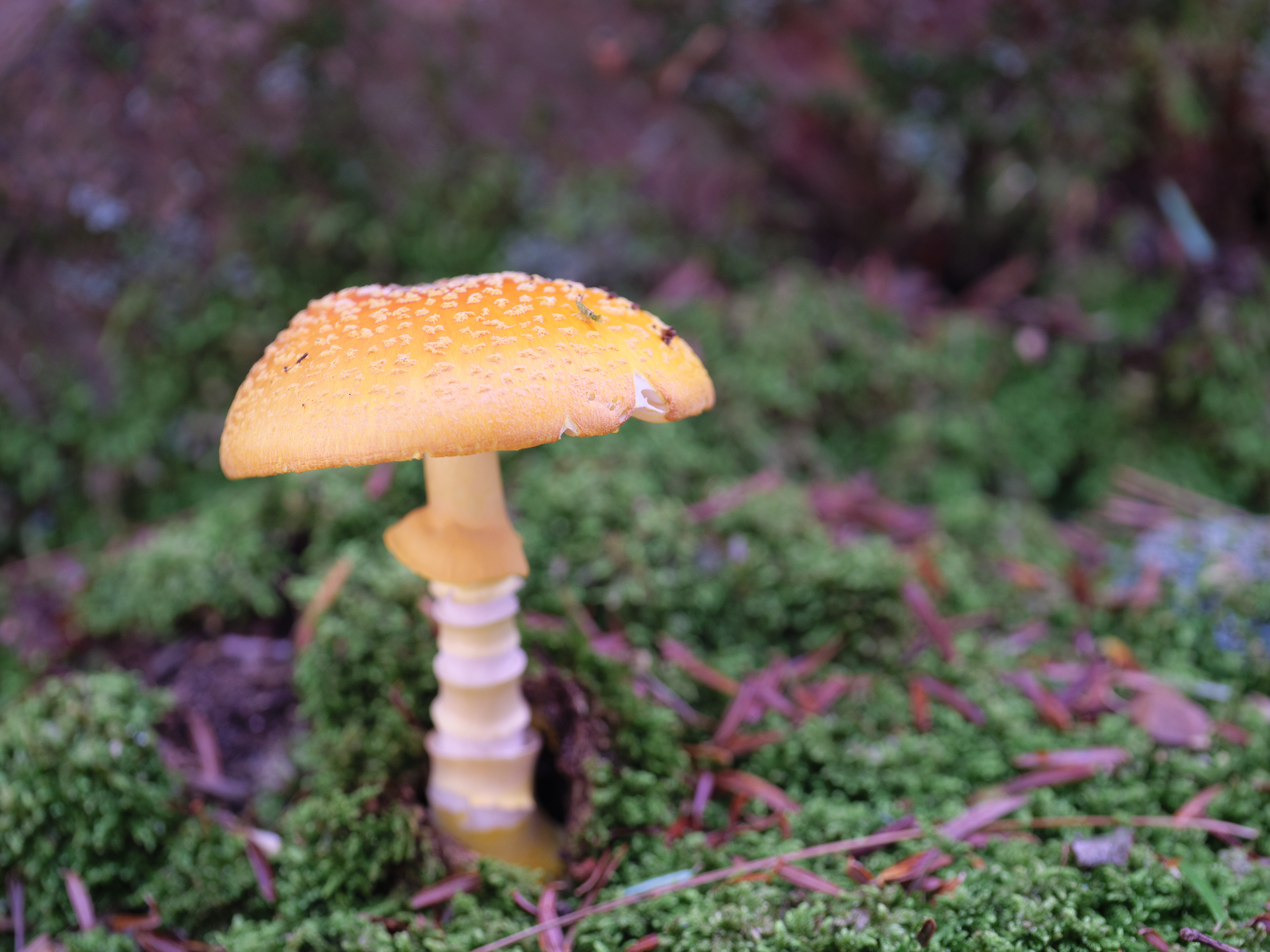
And a little closer look –

And here’s a shot that’s basically unedited and with the color as the camera rendered it –

What a difference huh? But it’s not a huge departure and to my eyes things look natural and normal. Now it seems to be later in the season than it was (actually only the end of September).
So what did I do? Well two things, first I opened the Calibration Panel in Lightroom and nudged some sliders (note: I moved the Calibration Panel up so it’s right under Basic, yours may be at the bottom) –

What this lets you do is adjust the intensity (saturation) and shade (hue) of the colors that make up each pixel of your photo – that is red, green and blue. Camera companies have already set what they’ve judged as baseline color rendering for all three and that’s why no two RAW or jpeg files look alike having taken the same photo at the same time.
But the Calibration panel lets you change that. So if you think your camera’s blues are too cool, moving the hue slider to the left will warm them for you. I’ve done that with this photo as well as increased the saturation for the blue in each pixel. Even if there is no blue in the photo like a sky, the change is dramatic as you push the slider in either direction. Blue is an underlying component to all greens and so those shades will pop as you go to the right and become more muted as you go left. Open a picture in Lightroom and move your mouse cursor over it and look at the R-G-B values shown under the histogram. Those are the percentages for each color in each pixel.
So why not just go to the HSL slider and change blue there?
Well, you can do that, too, but it is only going to affect the part of the picture that is showing blue. So with my example above without any real blue in it, there wouldn’t be much, if any, difference. Because the Calibration tool changes the pixels which do contain blue without rendering it as pure blue, you can affect how much or little is in that pixel and how warm or cool it is. Make sense?
But don’t ignore the HSL Panel completely if you want to make your fall photos appear a little more fallish.


Each aspect of color value has a role to play. As you can see, I hit the Luminance sliders harder than I did the others. That’s because I felt that the colors were flat and needed some life and vibrance without actually using the Vibrance slider which is a global adjustment, meaning it will add saturation to the least saturated pixels no matter what color they are. It doesn’t target specific hues or shades which the HSL panel does. If you want to be even more precise you can hit that little navigation dot just under Hue on the left – that will open a target picker tool that will highlight the corresponding slider color(s) as you move over the photo. Use your arrow keys or mouse to change the value of the slider up or down.
I used a similar combination of tools to make this change –

To this –

It’s subtle, but it looks more natural to me; more harmonious. And I didn’t have to mess with the White Balance slider as much. Sometimes doing that muddies color more than looks good and so if I can leave it alone I will. That goes for any color correction involving Green-Magenta. Using the same slider in Calibration changes the pixel mix in the shadows and keeps colors closer to how they looked to me, not how the camera rendered them. For photos with an extreme color cast you’ll probably need to use both. Sometimes deep shade in the woods will make my G9’s white balance go a little crazy. It’s easy to fix with both WB and Calibration adjustments, but here is an example using Calibration alone –
Severe color cast


Corrected! And with some color changes that I think work well.
At the very top of the Calibration panel is the Process Version. Leaving it at the latest is probably going to give you the best results since it ties directly to the Basic panel adjustment tools. It’s like when you open an old photo and the Basic panel looks weird until you hit the little lightning bolt under the histogram where it says Version. The tool sets and names have changed over the years and unless you update to the newest Process Version, only the old tools will be available to you.
Ok. Lesson over. Hopefully you found these ideas and tools useful for your own work.
Back to the lovely Pine River!

This is a view from further downstream and because the water level is so low I was able to get out onto rocks that are normally underwater. I spent some time trying out different compositions and shutter speeds. These days I prefer more texture in my water images so I tend to go with less than 1 second of exposure time. To me it speaks to the power and presence (not to mention sound) of the river itself and conveys that sense of energy. Plus there is more visual interest than with very smooth water.


These next two are quite special and I didn’t catch onto their relationship until I put them next to each other for this post. The first is a pair of what I think are young firs. They are on the top of a large rock, a boulder really, and waiting for their turn to be trees. Overhead is a larger fir and some other pole-sized trees that are taking most of the sunlight. With time and a little luck they will get their chance. Maybe only one will make it, or one will continue to shelter the other and both will thrive. I’ll never see it, but I can imagine.

As I can with this image –

That is the remains of what must have been a forest giant – a yellow birch. There were some nearly as big nearby, but this stump is just enormous. It’s almost 10 feet high. The rock ledge itself was about 6 feet high and after I got a glimpse of it while photographing the river, I went right over to see if I could shoot it. Only two angles worked well and I wished I had the taller tripod with me. Maybe next time. The two photos really show how different processing evokes different moods. The second is closer to how conditions were, but the first has a more open and welcoming vibe, don’t you think?

So it’s kind of a before and after of a tree that starts out on a rocky ledge. I wish I could be around for the in-between stages, but I’ll keep my eyes peeled for some. Here’s another brave plant trying to have a life on rocky ground. This is right in the river basically, but so dry I could sit on a nearby rock and get this.

Forest landscapes are some of the hardest to put together since there are so many competing elements, shapes, textures, colors and frankly, obstacles to deal with. So when I find something that might make a decent focal point, it’s nice to be able to frame it and even find a through-line. At least I hope I did. The fern and the big log is the draw, but I tried to stitch together the other fallen trees in the back to form a sort of zig-zag shape. This gives your eyes a path to follow through the back.

Believe it or not I’m going to head back to the Pine river to try again, but with different waterfalls. Both I’ve shot before, but I’m hoping for different angles and views. Getting to the other side of Breakwater Falls will be one and lower down for Lasalle Falls will be another. If you hit the link you’ll see both.
