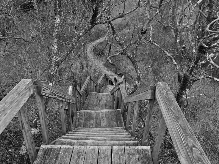
The next step along the monochrome brick road is manipulating images once you’ve converted them and done the basics like cropping, white balance and sharpening. Sometimes the color palette we’re presented with isn’t as dynamic in monochrome as we want it to be. I mean that the gray values of the colors aren’t separated, they’re the same. So try as you might the image just doesn’t work in some ways even though your composition and subject matter might be perfect. This often happens with colorless landscapes like this one –
What made me take this photo was the big tangle of trees and shrubs and the orderliness of the walkway in the midst of it. I knew when I took it that my end product would be in black and white, but also was worried that the tonal range wouldn’t be great enough. I was right. Notice how the walkway disappears as you move from the stairs to the back of the photo. The color of the wood and the color of the vegetation are about identical even to the eye. So how can I make this photo work?
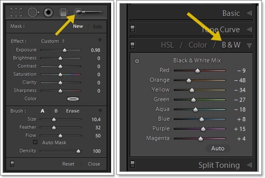
Color sliders were the first thing I went to. In Lightroom’s Develop module there is a panel called B&W and it only functions when you’ve done a conversion using the black and white button in the Basic panel (if you just move the saturation slider to 0, it won’t work since you took all the color out of a color photo). All the major colors from red to magenta have an individual slider that changes the intensity of that color in the photo. Slide it all the way to the left and the colors are saturated to 100, slide it the other way and they’re de-saturated to 0. In the photo the shade of gray is either darkened or lightened.

With this shot I concentrated on the orange slider, moving it to the left to darken the gray value of the orange in the branches and dead leaves on the ground. This helped make the far pathway more visible because the gray value of the planks wasn’t changed. So far, so hoopy. But I still wasn’t satisfied. The thing makes this shot work is the big distinction between the mad tangle of branches and the imposed order of the boardwalk, so that meant that the boardwalk had to pop more. What to do…ah, the adjustment brush.
This is a tool I’ve just begun to use more often. I liken it to the dodging and burning I did in the darkroom in the 80s. With this tool you can lighten or darken the exposure of an area easily. The brush proportions and intensity are almost infinitely variable and you can do much more than just change exposure with it, but for this article I’m only concentrating on exposure. Typically I’ll dial in a huge change just so I can see it clearly on the image. Once I know the area I want to cover is covered, I’ll dial it in to the exact value I want. It takes practice, but since Lightroom is non-destructive, I don’t worry about it. You can have as many do-overs as you want.

Using these two techniques in Lightroom made the most of this photo. The changes aren’t huge, but they work. I never want my images to be about the processing. Instead I want the processing to clarify and enhance the point of the image. I think leaving the mass of gray makes the chaos look even more chaotic, but the subtle use of the adjustment brush and the color sliders reinforced the sense of order provided by the walkway. Here are some other shots where I used either the brush or the sliders or both.


Hopefully, if I’ve done my job right, the processing doesn’t reach out and smack you between the eyes. I think my touch was light enough, but definite enough to bring out the strengths of each photo (or in one case, to minimize a weakness). That’s the key though – the image has to work in the first place. The composition, exposure, framing and subject matter have to be appropriate for monochrome. Then if the gray values aren’t helping those things, or some of the exposure values aren’t, the adjustment brush or color sliders can assist.
I’ve mentioned only Lightroom because that’s the editor I use, but most robust programs will include the same functionality at least where the color sliders are concerned. I’ve also not mentioned white balance or curves, things I also use in my black and white photography, I’ll save those for another article. For me, working a monochrome image in the ways I just talked about helps me reinforce the ideas and feelings I want to convey with my photograph. They’re part of the process that begins in my head, goes through my camera and then my computer to the final product. The key is knowing what you want to show and the tools that will help you do it. These are just a couple you should get to know and learn to wield with skill if you want to make the most of your B&W work.
Black and White 101 article in case you missed it


Another excellent post. One thing I haven’t done much of in LR3 is play around with b&w conversions. Since you like b&W so much, you should look into Nik Silver Efex Pro. All of my best b&w images have been converted in this wonderful piece of software. If you do their free trial, I think you’ll be hooked.
I think I’m going to have to give LR a fair shake though on my next b&w candidate.
Another fantastic post. It’s great to see more and more people paying closer attention to B&W conversions. This is easy to understand, and gets to the grunt of a good conversion. Well done.
Oh, and I’m another one that will vouche for Silver Efex Pro. Outstanding conversion tool in every respect.
Thanks for this, I’ve been looking forward to the 201. I shy away from post-processing, but you explained this clearly and it doesn’t seem too intimidating.